CheckBoxList Control
Description
Displays a list of checkboxes. Choices can be filtered and sorted.
Discussion
The CheckBoxList control displays a list of choices. The list of choices is easily filtered or sorted and multiple items in the CheckBoxList can be selected.
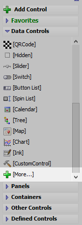
To add a CheckBoxList control to your UX component, click the [More...] item in the Data Controls section in the UX builder.
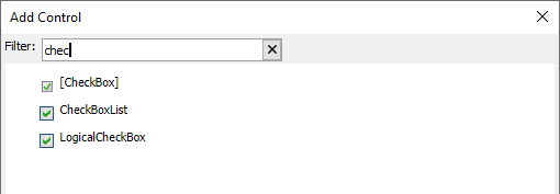
Or, click the Add Control button, search for "CheckBoxList", and click the CheckBoxList control to add it to the UX layout.
To configure the CheckBoxList control, open the builder by clicking the  smart field button for Control properties or double-click the CheckBoxList control. This will open the CheckBox List Builder.
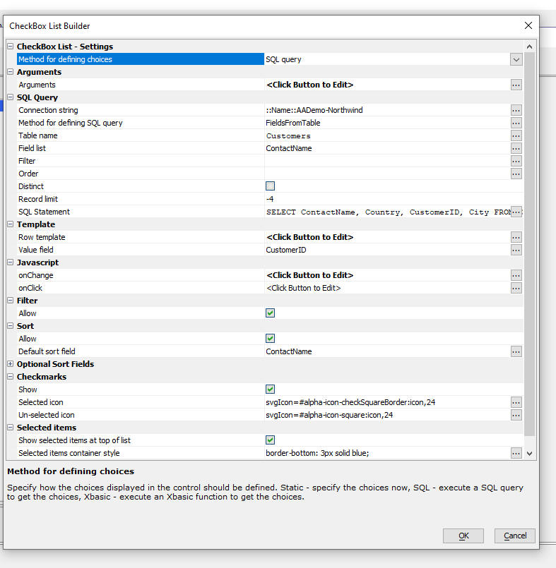
Important properties that you can set in the builder include:
- Property
- Description
- Method for defining choices
Can be a static list of data, data from a SQL query, or data returned by a Xbasic function.
- Row template
The template that controls the appearance of each row in the list. The template is any HTML that you want, with placeholders for fields in the data. The template is the same as the template in a List control that uses a freeform layout.
- Value
The field that determines the 'value' return by the control. For example, if you have selected 3 rows in the CheckBoxList and the value for the control is the CustomerId field, then the value of the control would be an array with 3 items. Each item in the array would be the CustomerId value for the selected row.
- Filter
Indicates if the List can be filtered.
- Sort
Indicates if the List can be sorted. You can specify a default sort field. You can also specify up to 5 additional sort fields in the Optional Sort Fields properties.
- Selected items
Can be used to sort selected items to the top of the list.
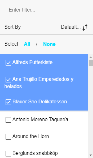
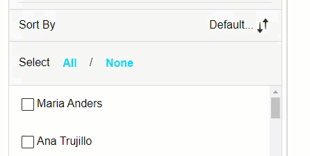
Filtering and Sorting
If sorting is enabled, the CheckBoxList includes a Sort By button. Clicking the sort button exposes the sorting options. The sort fields shown are configured in the Optional Sort Fields.
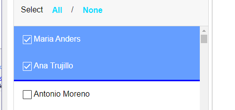
Selected Items
You can control whether selected items are show at the top of the list or in place using the Selected items properties. If selected items are shown at the top of the list, you can add custom styling for the container where selected items are shown.
Client-side Methods
The CheckBoxList control is a List control with a custom UI for editing the control's properties. Methods in the UX component and the List control's client-side API can be used to manipulate the CheckBoxList in client-side events and scripts.
Videos
Using the CheckboxList control to select rows in a List
The CheckBoxList control allows you to quickly select multiple items, much list a multi-select Select control, a checkbox control, a multi-select List control, or any other control that allows multiple selections, but it presents a very intuitive interface to the user.
In this video, we show how the CheckBoxList control is configured and is used to select records in a List.
See Also